Title Cards In Animation

fatface

New member
Foreword: I realize that I have asked people to post images of their favorite title cards in this thread, but such is not the only purpose of this thread. Please do not merely post images, as even though images are great, you should also take the time to participate in the discussion. I don?t want this thread to degenerate into a list thread where people merely post a bunch of images, as that would be bad for everybody. Regardless, if you do post images, please resize them and make them small so that they don?t stretch out the page or put a hindrance on people with poor internet connections. You should also take the time to explain why you liked the title cards that you posted.

I was looking over a thread in the NickToons forum about the latest episodes of ?The Fairly OddParents? and I noticed that many people were praising the series for its vivid title cards. In fact, there have been numerous posts on Toon Zone over the years about title cards, and this is not the first thread to have been created about them. However, I believe that title cards are slowly becoming extinct, as more and more animated programs are skipping the title cards and going straight into the episodes, with the titles merely flashing on screen in the beginning. So, I thought I?d ask a simple question.

Do title cards really matter to you?

Personally, I love title cards. Or rather, I love the ones that are actually something. A lot of animated programs have title cards that are merely words on a background; some of these animated programs are brilliant, such as ?Foster?s Home For Imaginary Friends?, but there?s no denying that such title cards are unimaginative for such an imaginative series. Still, I?d like to here what you have to say about this subject. Do you believe that title cards should be used more often or do you believe that they are overrated? Curious.

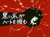
Also, I?d like to see some of your favorite title cards. I?ve already gone over the guidelines in the foreword, as I would very much like for this thread to be full of discussion instead of merely becoming a list thread.

TitleCardOne.gif
I like this title card because of the way that Flapjack and the rat look. They?re downright adorable. I also love the surprised look on K?nuckles face. I believe that this is currently the only title card of ?The Marvelous Misadventures Of Flapjack? that has had the characters appear on it, and I have to say it?s the only one that I have really liked. The others aren?t bad, per se, but title cards work best if there is more going on than just words.

TitleCardTwo.gif
This one I like because of its obvious differences from the other title cards for ?Yin Yang Yo!?, as the characters are drawn in a childish manner with disjointed parts and so forth. I think that it was rather clever. I did like several other title cards for the series, but I believe that this was the best one for this thread.

I?m looking forward to hearing your thoughts on the subject of title cards, and if you have the means, I?d love to see some of your personal favorites. I hope that I don?t scare anybody away with the lengthy foreword, but I?ve had several of my threads degenerate into a mess and get locked, so I?d like to try to avoid that.
 
Do title cards really matter to you?

Title cards aren't especially important to me (for me, a show can just superimpose the title onto the screen and get on with the story), but as an artist I can appreciate a good title card, if it's well done. But no, title cards don't really matter to me.

Titles, however, do matter to me a lot. One trend in animation which has always bugged me is this habit of shows not broadcasting their titles on screen, as if some producers or executives feel that displaying an episode's title is somehow "kiddie" and therefore not showing the title makes the show seem more mature somehow. I say that because the main cartoons which don't broadcast their titles tend to be action cartoons and prime-time animated sitcoms. It bothers me because I'm one of those people who strives to remember everything about my favorite shows, and knowing the titles is just an easier way to keep track of them; too often, a conversation will be slowed down by someone forced to try to explain the plot of an episode because they don't know the title. Stating the title is just plain easier and more convenient than saying "that episode where so-and-so happened". I say if a show doesn't want to paint full-blown title cards, they could at least impose or reveal the title somewhere, either at the beginning of the episode or at least at the end, like Space Ghost: Coast to Coast or The Venture Brothers.
 
I dont know how to post pics, but i LOVED the B:TAS title cards and dont know why they stopped using them (it would have been cool to see painted title cards for S:TAS and JL/U).
 
Rocko's Modern Life had good title cards. One of my favorites is the title to "I Have No Son," which showed Mr. Bighead screaming the title in front of a TV with Ralph Bighead in the monitor, as Mrs. Bighead, Rocko and Filbert look by. If you see it for the first time it makes you anticipate what it'll be about.

Speaking of title cards, the ones used in DiC Heathcliff series sorta amused me, because the drawing in the title cards doesn't have ANYTHING TO DO WITH WHAT THE EPISODE IS ABOUT. I remember one "Catillac Cats" episode where one of the cats' dog friend (can't remember the name) got fired, and the title card for the episode featured a space ship. Seriously.
 
it was explained in the awesome 'batman animated' book that when the move to kidswb! occured they not only wanted a new feel, but eric radomski who painted them was no longer around and noone else had the time to paint them....

but yeah, the batman ones are my favs. too. they always set the perfect tone of what you were getting in each ep.

i think the 'my life as a teenage robot' ones were also done in a really creative manner.
 
Some of my favorites are Danny Phantom title cards; each one seemed to be styled like a B-movie poster which had its own charm to it. I really want to get my hands on that Nicktoons book because of the full-page spread of all the DP title cards. Here are some examples, done by storyboard artist and character designer Ben Balistreri: (Edit: Apparently not. You can go to his blog and see them.)

titlecards3.jpg

titlecards2.jpg
 
I like shows that use title cards. Superfriends had some of the best ones, especially combined with the music/voiceovers imposed over them. The title cards don't have to be overly elaborate to get my attention, just don't them bland and lifeless.

On the animated ALF DVD that Lion's Gate released, I noticed that only the premiere episode had a title card, and the rest of the episodes merely had the title imposed over the start of the episode, which I found kind of weird.
 
I've already said most of my choices here, but I'll reiterate that I loved the title cards in Garfield & Friends, always very artsy and colorful and a real pleasure to look at.

I honestly wish more shows would do this. It gives each episode a uniqueness of its own from the get-go. I can't say I like generic title cards (like in PPG who for some reason didn't use fancy cards after the two pilots) and titles imposed over the actual episode.

bunnyrabbitsiscoming.jpg
 
I honestly don't see why title cards aren't used very often. They only take 15 seconds of air time (or less in some cases; the ones for TTA and A! are only about five seconds) but if they are well-drawn and have a memorable little ditty to go with it, they help to get you jazzed for an episode or short. I can't imagine the Looney Tunes, Ren & Stimpy, or Rocko without them.

And the shows that don't usually have them, like Family Guy and Duckman, are benefitted by the occasional episode with one, like FG's "Road to" episodes and Duckman's "Road to Dendron".
 
While not having a title card doesn't really bug me, I do like seeing the episode titles as said before. My favorite title cards would have to come from Ed, Edd, n' Eddy, if just for how wacky and detailed they are. I'm still noticing odd little things in them I didn't notice before.
 
I totally agree. It's also nice when the titles are simple. It's live-action, but the episode titles of Seinfeld are great because they're all just named after whatever the main storyline is: "The Soup Nazi," "The Pez Dispenser," "The Andrea Doria," etc. Talk about being easy to remember! Sometimes writers create what they consider are really fancy, flashy episode titles, but it just leaves me in confusion when I'm trying to find a particular episode.
 
I am a fan of title cards, because it shows that their art department really put some effort into this to showcase what the ep. is going to be about, as abstract as it may be. I liked the ones from The New Archies, as they were basically just one-panel gags like they would have in the original Archie comics, like Reggie, Moose and Veronica huddled up on top of Archie's dog's doghouse barking at them like crazy, and Reggie and Veronica in a horse drawn carriage being pulled by Jughead with Reggie holding a hamburger over him via a fishing pole.
 
2478736155_00145365a5.jpg


This title card here is basically one of my favorite FOP title cards. Putting them all on Mount Rushmore was a good idea too.


2495331531_6edeff0938.jpg
\


Another good one, Good idea making king being a checkerboard king.
 
Title cards are very important to me. Typical "overlays" just aren't as exciting. I usually prefer title cards with narrations (though this is pretty uncommon in American cartoons).

Batman: TAS

t-foc0a.jpg


I love Batman's title cards. Their slick, stylish, and just cool. I love the fonts they use too. The above is a favorite of mine.

Cutie Honey

cutietitle.png


The title cards in Cutie Honey are great (though they slowly dissappear as the series progressed). They have a creepy font, and are usually narrated by Panther Zora's seiyuu.
 
Since I'm strictly in a Danny Phantom mindset, I'll be showcasing those. One of the main reasons why I adore DP's art (baring Hartman's stiff character models) is the vast array of colors the series employs. They're so widely unpredictable and nontraditional that they stand out and really "wow" me.

The title cards are no exception and at most, are usually more dramatically displayed then the show itself. If anything, they really do convey a sense of emphasis on the episodes, getting me ready and all pumped to watch it just from seeing one. I have plenty of favorites in-between the 53 episodes DP had, but I picked out only a few (if not for the sake of people with not-so-image friendly computers).

DP1-1.gif


DP4-1.gif


These two are examples of bold coloring. They even compliment each other from side to side. Even in the first episode, the title card is striking for the massive amount of blue. The right edge is peppered in shadows where it wants to creep up on Tucker and Sam to consume. Not to be redundant with it's dark colors, smack dab in the heart of it is a very red Lunch Lady. The texts are a tasteful yellow.

"Shades of Gray" focuses strictly on red with very little else. It works because not only is there different shades of it, but because because it shows off the passion (red is often the color associated with it, after all) of ghost hunter Valerie. She's determined, there's a target readied at her enemy. She's big and tall, because she's far more aggressive and mysterious then the familiar ghost boy. He's puny and small because he doesn't know how to deal with this.

DP2-1.gif


DP3-1.gif


These two work because of the villains' role in the story. Both Vlad and Spectra are manipulative beings who plays with the minds of their victims. Vlad's large figure towers over Danny because he's bigger and better in every way. Danny is not prepared for this. The shadows surround Vlad, but they seem to embrace him as their Lord and Master, only to attack Danny under his command. His hands stick out ominously, ready to catch everything blocking his way, the signs, the logo, and Danny. Right now, Vlad is a God.

"My Brother's Keeper" is simple, but very telling and appropriate. Like Vlad, her first role had her pulling the strings of human emotion, to dig deep in order to devour for her vanity. Danny and Jazz's relationship is crucial in this episode and nothing speaks better of their animosity and eventually respect for each other then here, when Spectra joins and masters their predictability like a puppet master. The devious grin on her face only ups the ante. She's a Joker underneath that false human beauty.

DP5-1.gif


And sometimes DP will just go beyond eye candy or a symbolized premise. They instead bring you this. Freakshow's entertainment persona is directed by this lovely cue card that breathes and works of the olden days. The early 20th century when squares, bold walls, and fancy text and decorations adorned circus posters for years. Only with an added Gothic twist for his profession. It would definitely garner my attention if such a poster was promoted to the general public.
 
Wow, those DP title cards are very professionally rendered. I like those.

I can't think of any individual title cards that I particularly like, but I did laugh at the one for the Dexter's Laboratory episode "sdrawkcaB", only because they actually ran the opening credits to that episode backwards.
 
They were art. I love art deco, and if I could, I would BUY those title cards as paintings. They were just that wonderful

Something that bothered me with Samurai Jack was that, even though the art was so stunning, they had only a roman episode number at the end which dissapointed me. Perhaps silly of me? Because the backgrounds were usually so artistic...

Ed, Edd n' Eddy's title cards were also always very obscure, sometimes disgusting, but incredibly inventive. I loved those

I never liked the Danny Phantom ones, though. Even though I GET the b-movie style, it still felt like they over-did the artwork and then shoved it through a bunch of PhotoShop filters
 
I personally like Title Cards since it gives it more of a story book feel to it. Some of my favorites are despite my strong dislike for the show, FOP!, yeah I know I am a hypocrite. It is something that Anime does though the ones I mostly watch have it in front of an animated piece of scenery with the character reading it aloud. It gets me thinking that since most of the shows are aimed at kids, they have the titles read a loud in Japan so i guess Kids can understand the title, so why isn't that a common practice here in America. The only recent show I know that did that was "Krypto the Superdog."
 
Because our alphabet doesn't have 5000+ characters? Just guessing

If you look at American cartoons for VERY young children, the title card is usually read aloud, or they don't have one
 
Back
Top