Favorite Ninja Turtles design? (animation)

Daikaotikao

New member
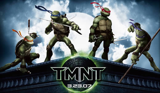
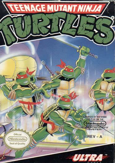
Personally, I'm favorable towards the '87 design not only because of nostalgia, but I think being able to see the Turtles' eyes through their masks makes them more "human" so to speak, not to mention that I hate the multi-shaded '03 versions; they don't even all look like the same species in that show! So, I guess the TMNT versions would be a close second, as they seem more inspired by the 80s show.

tmnt_nes.jpg

Teenage%20Mutant%20Ninja%20Turtles_1987.jpg

tmnt.jpg

tmnt_poster.jpg
 
I'm partial to the 80's designs, but it's the new look they got for season 8 (The Red Sky eps) that I like the most. The one where they now looked more like their live action movie counterparts.
 
I like the different shading and slightly different designs for each turtle. It gives them a distinctive feel in their appearance which they really never had. Even with the different colored bananas they were pretty much the same character drawn four times.

It makes them more distinctive.

So I go with 2k3.
 
The 2k3 designs remind me of the old action figures, where the turtles were each a different shade of green. I like all of these designs and each one has been my favorite at one time or another but right now I'm pretty keen on the TMNT style. It's the least bulky and probably the most ninja-like .
 
I like both the 87 original series and the TMNT. If April is also included then the 87 series would win. TOS has the best April design and I prefer her as a Lois Lane clone over her being a purveyor of antiquities.
 
I like the 2K3 designs myself. They recall the Eastman and Laird comics and they make the Turtles look more distinct; with those looks there's a way to tell them apart aside from their weapons and headbands.

The TMNT movie designs were OK too, but all 4 Turtles were the same color, so it made them a little less distinguishable.
 
You know what's funny? I always remembered April as 'the token damsel in distress', but as I rewatched TOS on DVD lately, I noticed that she often helped save the day more often than she got captured/held hostage. And yeah, her TOS design was cool.
 
FYI, there were actually three animation designs used for the original cartoon: Syndicated style (colors looked a bit bolder and there was more shadowing), Saturday style (the animation got a bit wackier and often brighter), and "Red Sky" (dark and serious-looking style with the turtles looking much older).

Honestly, I loved the syndicated style best out of the three. It just...fit.

But out of all the designs, I like 2K3 best. It really gives the turtles that individual difference that separates them from looking like the same character recolored four times. Plus, it made that nude scene in the first episode of Fast Forward a heck of a lot less confusing. :p
 
I grew up with the original series, but I think I definitely prefer the 2K3 designs the most, for many of the same reasons already mentioned. But the '80s design would be a close second, and I thought the new TMNT designs were ugly.
 
Eastmean and Laird's original drawings have a special flair to them but since we're talking animation I'll focus on those.

Rated in order of awesome

1) TMNT 2003 Seasons 1-5
2) TMNT 1987 Pilot (there's something about those designs that I really liked, but it's only when they looked as good as they did in the theme song)
3) TMNT CBS Blue Sky Seasons
4) TMNT CBS Red Sky Seasons (edgier yes, and consistant more often but not neccessarily better than the Blue Sky CBS Seasons)
5) TMNT 2007 Movie (honestly I don't like the designs that much but they were well done)
6) TMNT OVA (the turtles and splinter looked good, April got a major makeover, Shredder... well... that was different but pretty nice none the less)
7) TMNT 80s Syndication (inconsistant and often just plan bad)
8) Back to the Sewers (could rise on the list potentially)
9) Fast Forward (yeah... a few things looks alright but I'd rather watch the bad animation of the syndicated TMNT seasons and that's saying something)
10) CGI Series Pilot (oh good heavens this looked awful)

Now we never saw how the designs looked as animation but the WB TMNT show designs weren't too bad. I liked the throw back to Eastman and Laird's old style. I'd say they're better than 80s Syndication design perhaps better than OVA design.
 
Like other members have already said, the 2k3 designs for their subtle differences that give the turtles more individuality than the 80s designs.
 
I dunno, I always felt that the '87 show did a good enough job making their personalities different that they didn't need something...else to separate the four. Not that I'm saying the 2003 show didn't do a great job making the characters individuals...well, actually I guess I am saying that. Granted I've only seen a few episodes of the show, but I guess I like the broader stuff better when it comes to this type of cartoon.

And I'm starting to think I shouldn't have even put that first option up there...
 
Do you happen to remember which episodes you saw of 2K3?

Because there were episodes that showed each turtle as their own individual character...Especially during seasons 3 and 4.
 
Back
Top